
How to Fix “Clickable Elements Too Close Together” Error in Google Search Console


Most average users access the internet from a mobile device. Therefore, failing to ensure a mobile-friendly website can harm potential traffic growth and overall search visibility. One of the ways this can happen is when Google flags your page with a “clickable elements too close together” error.
The “clickable elements too close together” errors indicate poor mobile navigation. It’s one of the common issues webmasters encounter.
In this article, we’ll receive a comprehensive idea of this issue, and how to fix it to optimize your website for mobile friendliness.
So, let’s get started.
What does the “Clickable elements too close together” error mean?
Clickable elements are any interactive elements in your webpage such as buttons, links, navigation menus, forms, etc. that can be clicked by the user. These elements allow the user to take a specific action such as:
- Navigating the webpage
- Performing an action
- Submitting forms, etc.
When users are interacting on your website, they will likely click on clickable texts or graphics. If the proximity between the clickable elements is too close, the neighboring elements will also get clicked.
As a result, the user will find it difficult and frustrating to perform the desired action, which results in a poor user experience, Thus, Google suggests not keeping the clickable elements together.
The best practice is to keep substantial space between the clickable elements for mobile users. It facilitates the use of any clickable target comfortably, ensuring neighboring elements of the webpage don’t interfere.
Why does Google show “clickable elements too close together”?
Once we’ve understood what this error means, the next step is to identify why Google Search Console is putting an error flag on it.
Google predominantly uses mobile-first indexing. Thus, you have to design a website that mobile users can navigate effortlessly. If Google detects any mobile usability issues, your SEO performance will drop and you’ll lose traffic.
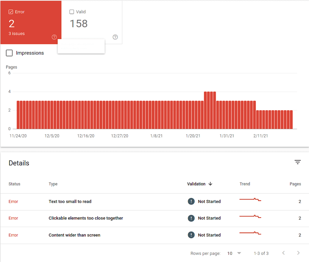
Here are a list of errors you may encounter in case of a mobile usability issue:
- Clickable elements too close together
- Content wider than the screen
- Viewport not set
- Viewport not set to “device-width”
- Uses incompatible plugins
- Text too small to read
However, our primary focus is understanding the issue of “clickable elements too close together” and determining the reasons that prompt Google to take such action. Let’s check out three primary reasons for receiving this warning.
Poor interface design
While designing a website you should keep in mind that not all your visitors are from desktop. In fact, half of the web traffic population originates from mobile devices, and if you don’t consider them while designing your website, it can result in a poor user experience for them.

If you place and scale too many elements on a single webpage, the webpage becomes congested for mobile screens. As a result, when mobile users visit your website, they struggle to view and click the target element.
What happens next?
Well, they bounce back from the website!
Mobile responsiveness issue
When a website faces mobile responsiveness issues, it means that the website’s design, layout, and interactive elements aren’t optimized to provide a seamless and user-friendly experience for different mobile devices.

This possibility sums up that your website might have a mobile responsiveness issue. As a result, if the website is visited from different mobile devices, it’ll display slightly askew or distorted parts of your webpage for different screen sizes. This means the clickable elements on smaller screens may distort or overlap due to limited space.
Google cannot initiate resource requests
Another potential reason for receiving this error is Google might have failed to request the required resources during the page rendering process.
So, make sure you run a mobile-friendly test every time you make changes to your website. If it passes the test then there’s no need to worry. But if the test fails, you have to adjust the changes for mobile friendliness to avoid such errors.
This practice should be followed if any changes or updates are made to your website to ensure mobile version optimization.
Which HTML elements are clickable?
If your website is powered by WordPress, then you need to know which HTML elements are used for click events. This will help you to better understand the problem you’re facing currently.
Technically speaking, several clickable elements serve the function of clicking. These are-
Anchor element
The anchor element or ‘<a>’ is used to create hyperlinks in a website. This allows the user to navigate to a specific location on the page or navigate to another page.
Here’s an example of an anchor element:
<a href="https://www.example.com">Click Here</a>Button element
The button element or ‘<button>’ is used to create clickable buttons within a website. This helps to trigger an action, such as submitting a form or performing a JavaScript function when clicked.
Here’s an example of a basic button element with text content:
<button>Click Me</button>Input element
The input element starts with ‘<input>’ and closes with ‘<input />’. Certain input elements perform click functions like checkboxes (‘<input type=”checkbox”>’) and radio buttons (‘<input type=”radio”>’).
The basic syntax of the input element is as follows:
<input type="text" name="inputName">Select element
If you want to select an option from a list then the select element or ‘<select>’ can help. It creates a dropdown menu that users can click. It is generally used in forms or for selecting options from a predefined set of choices.
Here’s an example of how to use the select element:
<select>

  <option value="option1">Option 1</option>

  <option value="option2">Option 2</option>

  <option value="option3">Option 3</option>

</select>
Text area element
The primary function of the text area element or ‘<textarea>’ is to perform multiline text input. But it can be used as a clickable element by attaching event handlers. A click event handler is used to trigger specific actions when the user clicks within the text area.
Here’s an example of the text area element in HTML:
<label for="message">Message:</label>

<textarea id="message" name="message" rows="4" cols="40"></textarea>
Image element
The image element starts with ‘<img>’ and ends with ‘<img />’. It is used to display images within a website. Although it’s not implicitly clickable it can be wrapped in an ‘<a>’ element to make images clickable as hyperlinks.
Here’s an example of the image element in HTML:
<img src="image.jpg" alt="Description of the image">8 steps to fix the “Clickable elements too close together” error
The “Clickable elements too close together” error affects user experience and search rankings. Therefore, you need to fix it as soon as possible to avoid any negative impact on your search engine ranking and ameliorate the mobile browsing experience.
It all starts with identifying the reasons behind this error. And, once you’ve identified the underlying reasons now it’s time to optimize the clickable elements of the affected web pages. Follow the below steps to fix the error:
1. Pinpoint the example URL
The first thing you need to do is to identify the example URL flagged for this error.
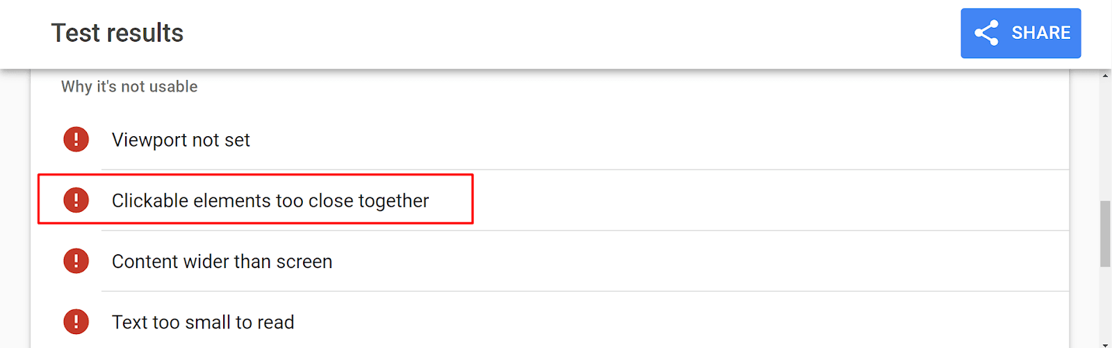
To identify the example URL log into your Google Search Console account and examine the example URL returning this error.
Then go to the Mobile Usability section and click on the error where it’s written. This will lead you to the number of affected URLs and one example URL.
Last but not least, open the example URL in a separate tab.
2. Perform a mobile-friendly test
After identifying the example URL, you need to run a mobile-friendly test.
But how to do it?
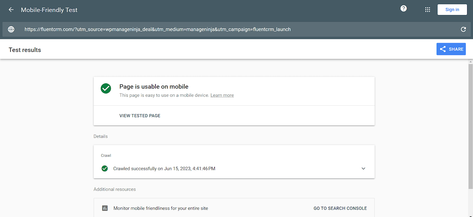
Go to Google Mobile-Friendly Test, paste the copied example URL, and hit ‘Test URL’. It’ll take a few minutes so wait patiently. When the test is finished you’ll receive a result like this.
But instead, if you receive a confusing result like your page is usable on the mobile device with no error, then go to Bing – Mobile Friendliness Test Tool and test the example URL.
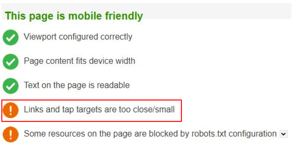
It’ll provide you with a crystal clear result, for example, Links and tap targets are too close/small. This means the example URL is affected by the error and needs to be fixed.
3. Optimize the touch target for improved functionality
Currently, most mobile users use Android smartphones where the most effective way to interact with the device is through the finger. As a result, the touch target is another important factor you need to consider while optimizing your website for mobile friendliness.
This error might be displayed for various reasons, but the commonest of all is because the touch target of the clickable elements is not optimum.
Designing a single, flawless static layout for all devices is impossible. So, the best practice is to create a flexible layout using device-independent pixels (dip) for defining tappable targets. Elements defined using DIP can dynamically scale to fit the user’s screen size automatically.
The minimum recommended size of the touch target is 48×48 pixels for a mobile screen. It equates to approximately 9mm, which is substantial for an average person’s finger pad.

Now to identify which tappable elements are the source of this issue you need to investigate each element’s dpi. For example, if the clickable element’s touch size is below the recommended value (e.g. 20px) then you need to adjust the padding to 48px.
How to do it?
Firstly, you need to identify which touch targets are causing the problem. Download and install the Mobile/Responsive Web Design Tester extension in your Chrome browser.
Now go to the extension and select a device model to emulate the mobile version. It’ll appear on a new tab.
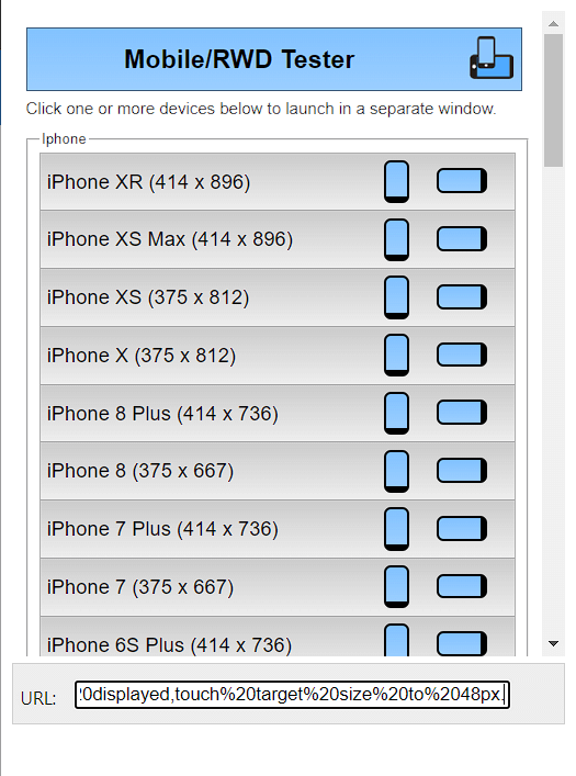
Next point out the clickable elements that are too close to each other. After identifying which elements are too close, go back to the desktop version and point the cursor to the identified elements.
Now to check the computed area of the tappable element go to Chrome DevTools or Firefox DevTools. In our case, we’ll use the Chrome browser.
Right-click and go to Inspect and launch the Chrome DevTools. Then go to the top left corner and select the arrow icon. It’ll help you to select the targeted element in the webpage.
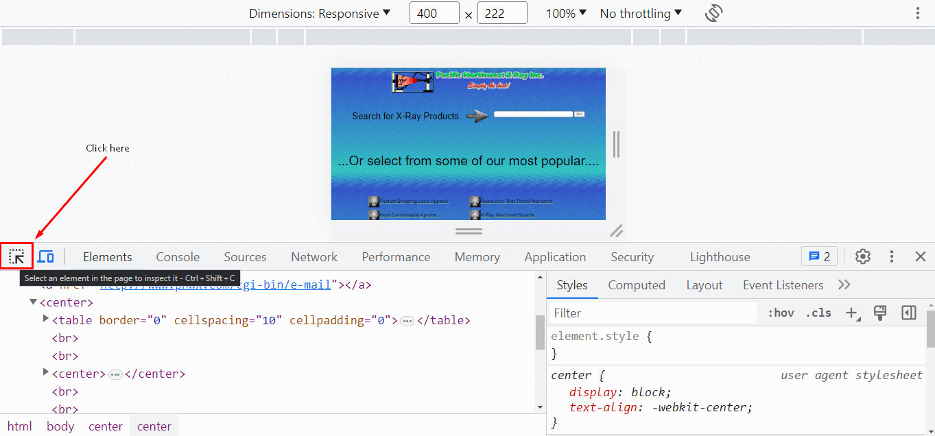
After selecting the unoptimized element it’ll display the size of the tap target and padding in the right corner.
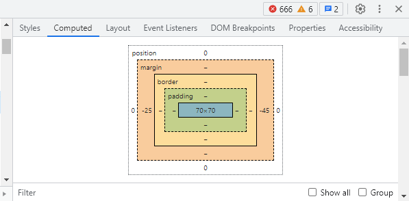
Now increase the touch target to 48px and introduce an 8px spacing for each touch target.
4. Use YellowPencil – Visual CSS Editor
Editing and optimizing your website’s CSS and theme files is another important step to recovering from this issue. However, if you don’t have any coding skills, there’s no need to worry.
Download and install the YellowPencil Visual CSS Style Editor plugin on your WordPress site. It’ll help you to click on any element to start visual editing without any coding.
When you’re done installing go to Plugins > Installed Plugins to find out YellowPencil and activate it.
Now navigate to YellowPencil > Customizations > Let’s Start! This will lead you to a new tab where you must select the target page causing mobile usability issues.
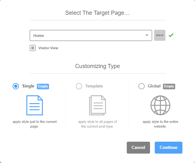
You can operate on a specific webpage or entire website. But if many web pages are affected by the mobile responsiveness issue then select Global. So, select your preference and continue.
Now you can travel your webpage and select any clickable element that requires attention. YellowPencil will provide you with a panel of customization for that specific element.
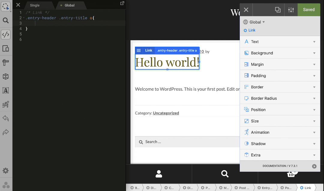
For example, if you want to adjust the padding then select Padding and add 10px to each direction.
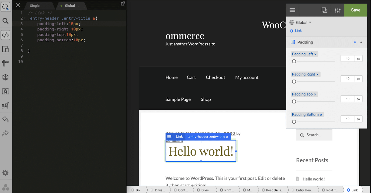
Moreover, the Size and Position options can be used to shape and relocate the clickable elements to optimize usability. You can directly edit the CSS code in the left panel if you want.
When you’re done with optimizing the target element, move to the next element and repeat the process. Continue this loop until you’ve resolved the issue and are satisfied with your editing. Finally, click the Save button to save the changes.
5. Inspect the input method
The input method determines how a user interacts with your website. It can be through a touchscreen, or a mouse and trackpad. It helps to identify whether they’re interacting with a smartphone, tablet, or mouse.
When it comes to the precision level touch is considered less precise than a mouse or trackpad. Now to determine the primary input method of a user “pointer” technique is used. The input can have one of two values:
- Coarse: This means the user’s primary input method is a touch
- Fine: This means the user’s primary input method is a mouse and trackpad
If the pointer returns a coarse value this means the input method is touch. Now adjust the size of the tappable target by adding the following CSS code in the CSS file of your WordPress theme.
.container a {
  padding: .2em;
}
@media (pointer: coarse) {
  .container a {
    padding: .8em;
  }
}
Next, ask Google to recrawl the website and determine whether the problem is fixed or not. Moreover, you can tell Google to recrawl individual URLs using the URL Inspection Tool.
After submitting the URLs select Request Indexing, it’ll test the URL for indexing issues. If Google unearths no issue the page will be indexed.
6: Configure the Mobile Viewport Tag
Another reason for receiving this error is your website doesn’t have a viewport tag. The absence of this must-have tag will raise the chances of receiving mobile unfriendliness issues.
A mobile viewport tag informs a browser to set the width of the viewport to match the width of the user’s device. It ensures that the mobile visitors of a website receive the best experience in viewing and interacting with tapable elements.
To set the mobile viewport tag of your website add the following code in the <head> of the HTML code:
<meta name=”viewport” content=”width=device-width, initial-scale=1″> Inserting this code will fix the mobile usability issue and your site will become more mobile-friendly.
7. Break the barrier of robots.txt
In some cases, your site will pass all the tests but you might still receive the same error. It’s because some required resources are disallowed by the robots.txt file which blocks CSS and JS files.
Inspect and edit the robots.txt file to ensure relevant resources such as /wp-admin/ are not disallowed. Most of the SEO plugins will help you to edit the robots.txt file or your hosting company can assist you in accessing the file through FTP or a server console file editor.
8. Validate Error Resolution
After applying all the suggested steps it’s important to determine whether the problem is fixed or not.
To verify the fix, go to Google Search Console and click on Validate Fix for the URL. You’ll discover the option in the upper right corner where the error is portrayed.
Then the validation process will get started and it’ll take some time so be patient. When the validation process is completed Google Search Console will display a message like “Passed”.
Congratulations! Hard work pays off and you’ve succeeded in fixing the error and your website is user-friendly, ensuring an optimal user experience for all mobile devices.
Optimize your website for user-friendliness!
We’re currently surfing in the age of the Internet where mobile responsiveness is a huge factor for SEO. Google wants your website to be a user-friendly one to provide the best browsing experience.
A mobile-friendly website ensures a user passes the best time when scrolling and interacting with the website. And as a website owner, it’s your duty to ensure a seamless browsing experience for every user.
We hope that this article will help you resolve the mobile usability issues and your website will become more user-friendly and optimized for mobile users. And don’t forget Google loves this too!

Aminul Islam
Hi! Nice to meet you. I’m a guy who loves to explore, learn, and share knowledge. I spend most of my time catching up with marketing tips & tricks. When I’m not busy with any of these, you’ll find me with a book, exploring the city, or playing my favorite games.
Table of Content
Subscribe To Get
WordPress Guides, Tips, and Tutorials


Leave a Reply